Waterfall charts are a great way of visualising contributions to a total or a total variance. They allow you to analyse how a value is influenced by the cumulative effect of underlying positive or negative inputs. This can lead to quicker and more effective business insights.
Waterfalls are available as a chart type with XLCubed, in either a column or bar orientation. They connect directly to your data source, are fully interactive, and are easily inserted into an Excel sheet.
How to Create an Excel Waterfall Chart for Time Analysis
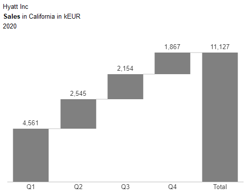
Let’s first take a look at building a couple of waterfall charts to show the quarterly and monthly contributions to an annual total. First, insert a dynamic chart from the XLCubed ribbon and select the waterfall chart type. Since we will be showing time-related data, we should choose the column orientation, for a horizontal waterfall.
From here, set up is like any other chart type. Place the relevant measure and any other required dimensions on filters. On the horizontal axis, we want to show levels of the date hierarchy, so this is what we place in the Categories field. Click on the hierarchy to show the member selector. Here you can select which members or levels to display.
We now have a simple waterfall showing the quarterly contributions to the year’s total sales.
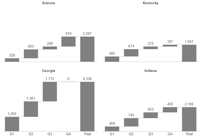
Small Multiple View
As with all XLCubed’s dynamic chart types, we could display this chart in a small multiple view. Place your desired hierarchy on columns and/or rows to display a chart for each member. For example, you could view across different product groups or sales regions.
Variance Waterfalls
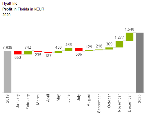
Let’s now create a chart using the variance waterfall chart type. This chart is used to show the breakdown of a variance between two or more total values. We will show the total values for 2019 and 2020. Between the two totals will be the breakdown of the monthly variances.
Select the column variance waterfall chart type and set up any filters as before. We now need to configure what to display along the category axis. This should be the two (or could be more) total columns. Add the date hierarchy and select the current and previous year in the member selector.
We can then configure what the variance will be split by. By default, this will be populated by the same hierarchy, so all we need to do is select which level we want to display. From the drop down we could choose either the quarter or month level.
The ‘Split Categories by’ field could also be populated with another hierarchy. For example, you may wish to show how different regions contributed to the change in sales between Q1 and Q2. To achieve this, keep the date hierarchy in the categories field (remember, this is for the total columns). Then add the geography hierarchy as the categories to split by. Click on the hierarchy to make your desired member selections.
Now that we are analysing the variance by category rather than time, the IBCS rules recommend that the chart should be displayed in the vertical orientation. This has the additional benefit of better handling and readability of potentially long member names.
Advanced Member Selections
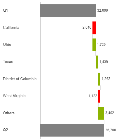
Consider the waterfall chart below. The intention is to show how each state contributed to the change in sales between Q1 and Q2. However, due to the large number of states, the chart is overcrowded and difficult to read. It would be much better if we focused our message on which states made the greatest contribution.
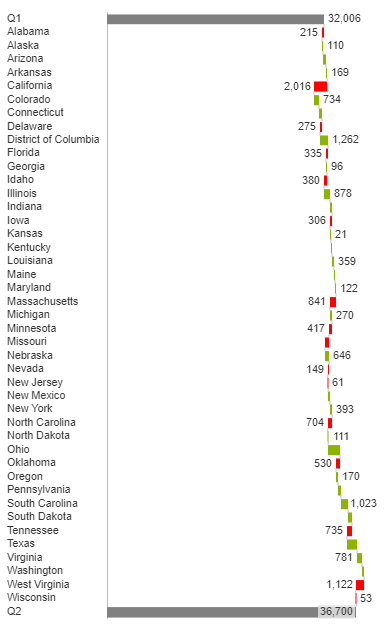
To achieve this, we will make an ‘outlier grouping’ on the country members. This will rank the top x states. Any states that fall out of the ranking are grouped into a single category.
Select the geography hierarchy and then move to the Advanced tab of the member selector. From the drop down, select Outlier Grouping > Rank and group outliers. Here you can configure the ranking and name for the outlier grouping. For a variance chart, the measure that you rank on can be the variance or absolute variance.
The resulting chart is much clearer. It is easy to read which states had the greatest variance between Q1 and Q2. This then drives further analysis and informs where investigations need to take place.